
Sappho’s Circle
Queerness Bound
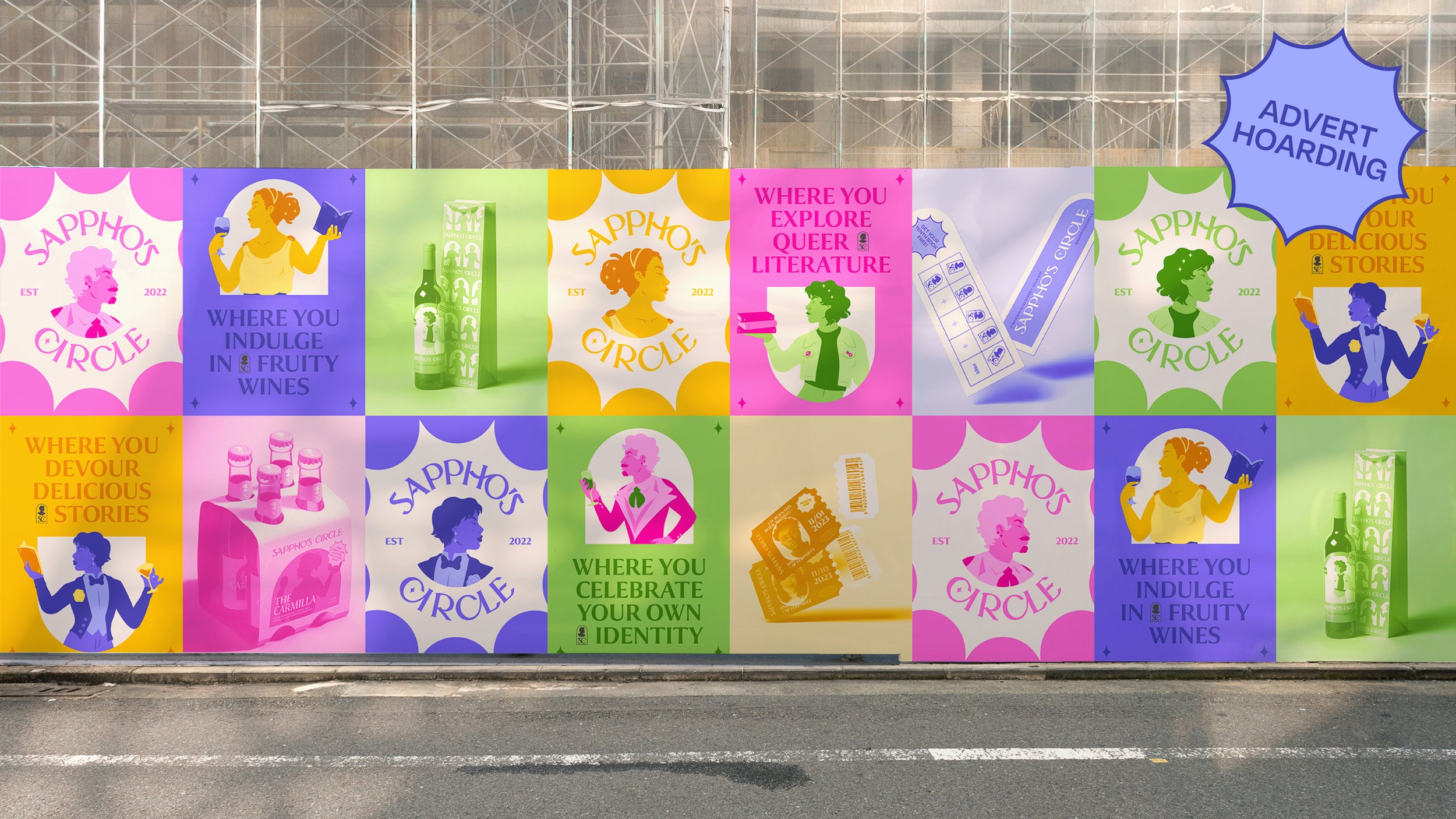
- Brand Identity
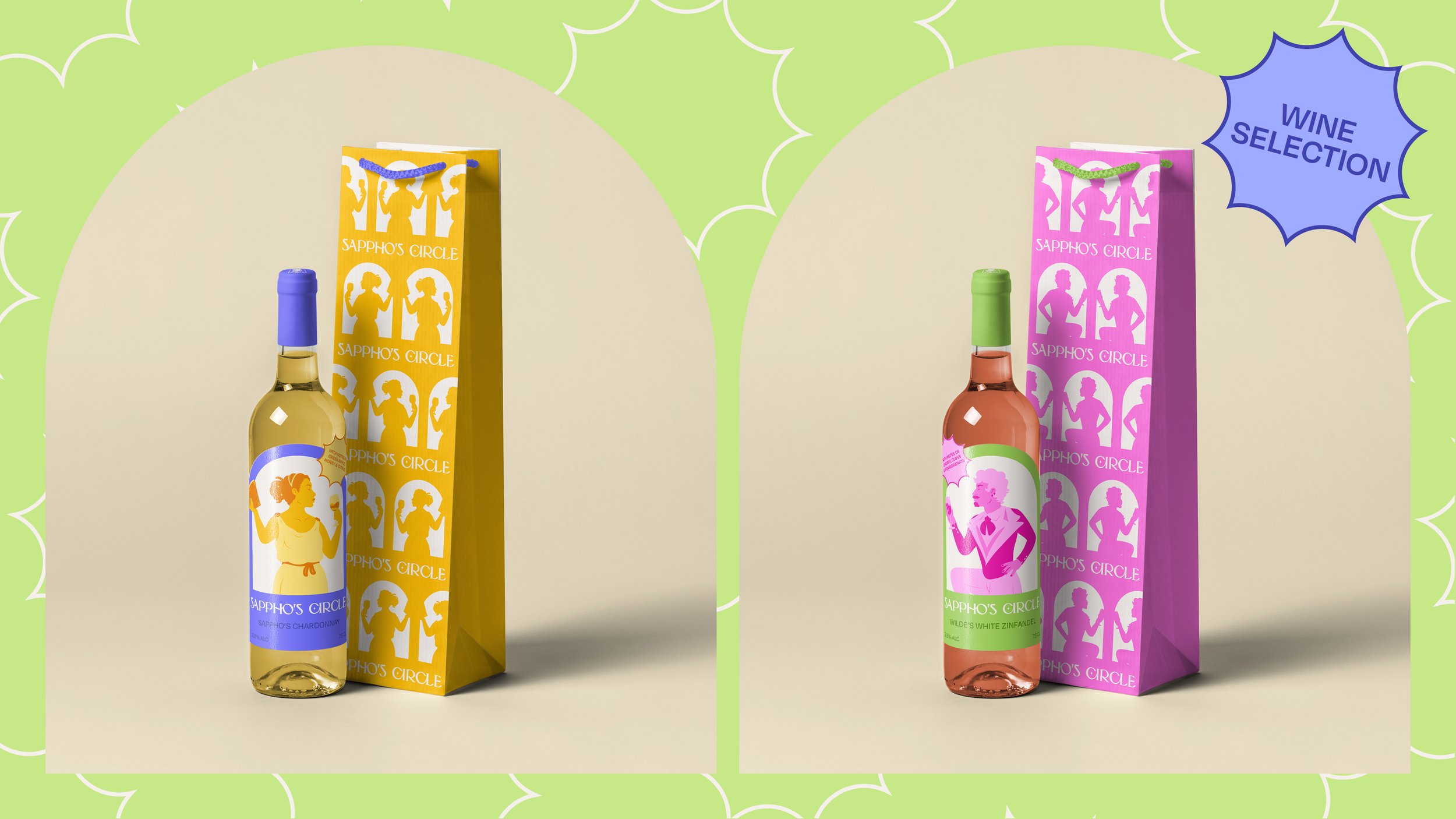
- Product & Packaging Design
- Illustration
Third Year University Project
- Campaign Design
- 3D Modelling
- Copywriting
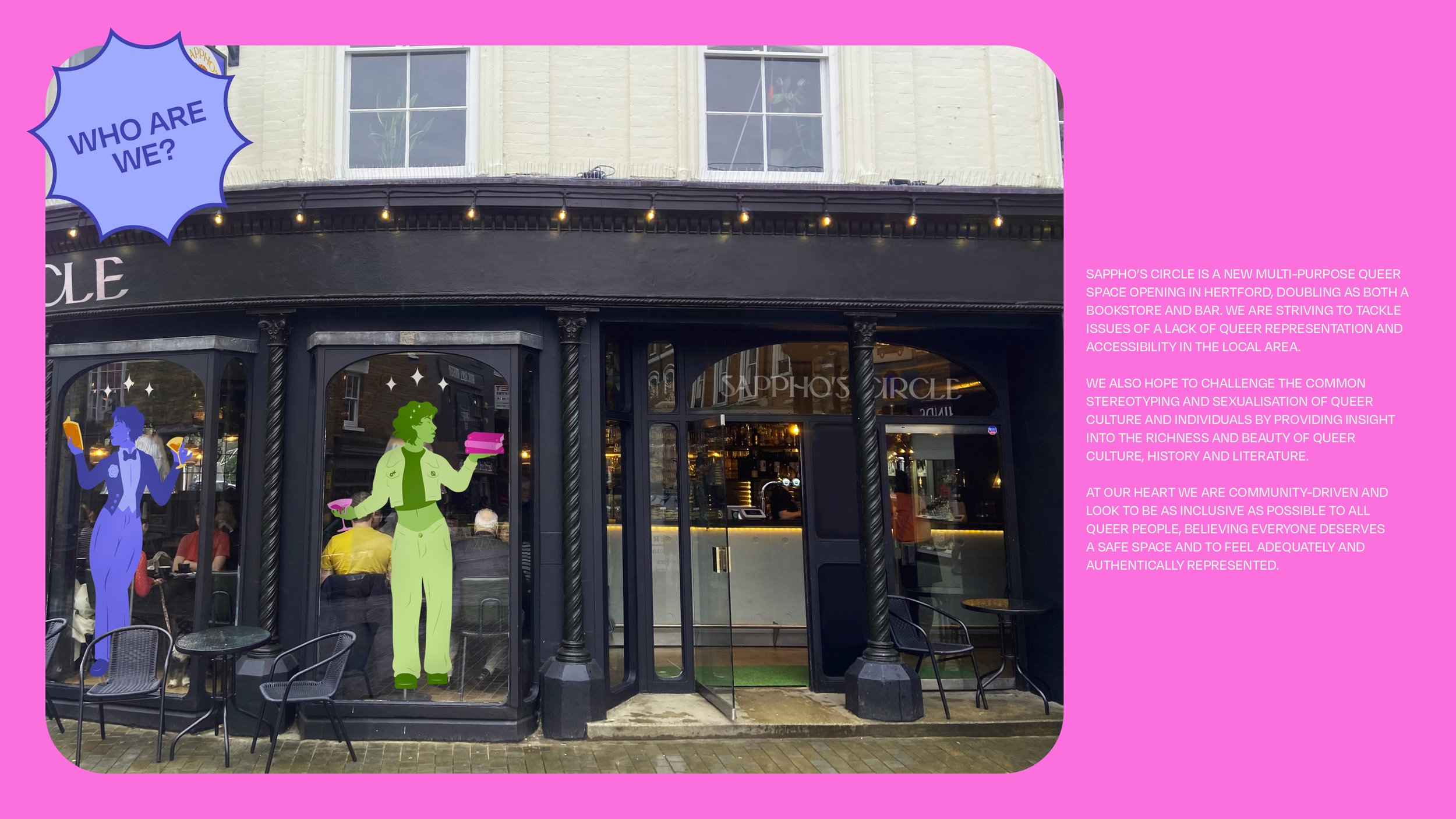
We were tasked with reimagining an existing space in our local area to give it new life, this led to the development of Sappho’s Circle. Sappho’s Circle is a multi-purpose safe space for queer people within Hertford and the surrounding areas. The space serves as both a day-time bookshop and a night-time bar, in hopes of providing much-needed representation while also challenging the stereotyping and sexualisation of the queer community.
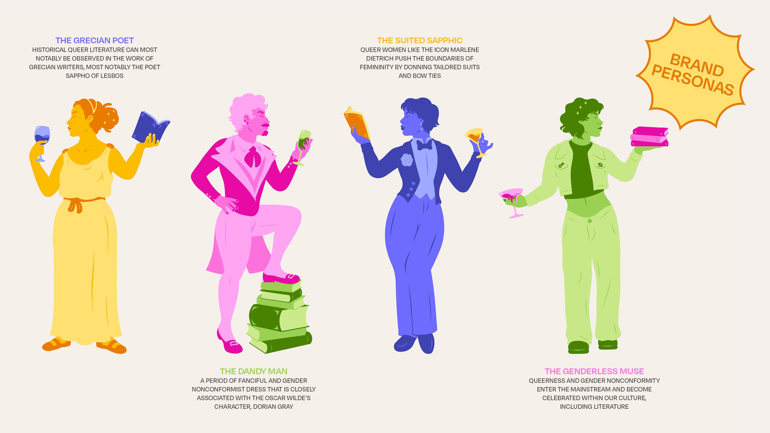
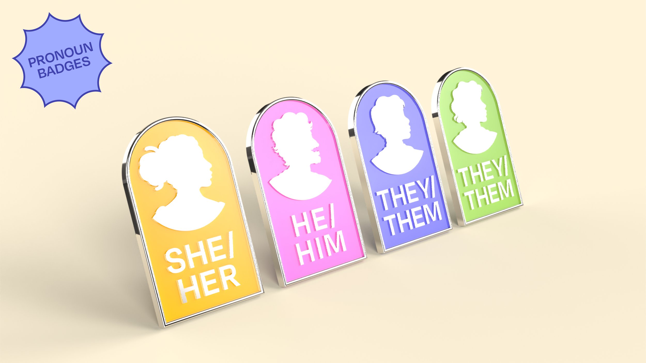
Both the brand name and visuals reference the architecture of the building, such as the Grecian-esque arched windows and columns. The visual identity is also built upon the foundation of a set of illustrated brand mascots, each referencing the history of queer culture and literature, namely through their fashion as a reference to the space’s past life as a clothing and drapery store. These illustrations were developed to provide the identity with a more universal appeal and authenticity, a thing queer venues often struggle with, as one of the only universal experiences of queer people is their refusal to conform to societal norms, often observable through their fashion and personal expression.